
Tiny Superheroes

TinySuperHeroes exists to transform how children experience serious illness, shifting the emotional narrative of care from fear and isolation to identity, courage, and belonging. When KAL partnered with the organization to design the 2025 Impact Report, the opportunity was not simply to summarize a year of activity, but to translate that mission into a clear, compelling, and human centered story system that could live across donors, families, clinicians, and institutional partners.
The report needed to function in two modes at once, as a scannable proof of progress for supporters and a deeper editorialized moment in the Tiny Superheroes journey that honors the lived experience of the children and families at the center of everything the organization does.
From the outset, we moved away from the conventions of a traditional impact report. Rather than organizing the document around outputs, we framed it around transformation. The structure was designed to reflect how TinySuperHeroes shows up in the real world, moving children from fear, to identity, and from the isolation of diagnosis, to a sense of belonging. This narrative became the organizing principle for the entire report, ensuring that every section reinforced a single throughline, courage is what changes how care is experienced.
Our process began with a storyflow architecture and pagenation before any visual design decisions were made. We defined a cadence that could hold multiple audiences and reading behaviors, mapping the report around who TinySuperHeroes serves, the environments in which they operate, how their model works in practice, and what change that model creates in real clinical and family settings. This allowed the report to communicate clearly to donors seeking accountability, hospital partners evaluating program value and fit, and families who need to feel seen and represented. Each layer of content was designed to stand on its own while reinforcing the same core message, so the story reads consistently whether the report is skimmed quickly or read intimately.
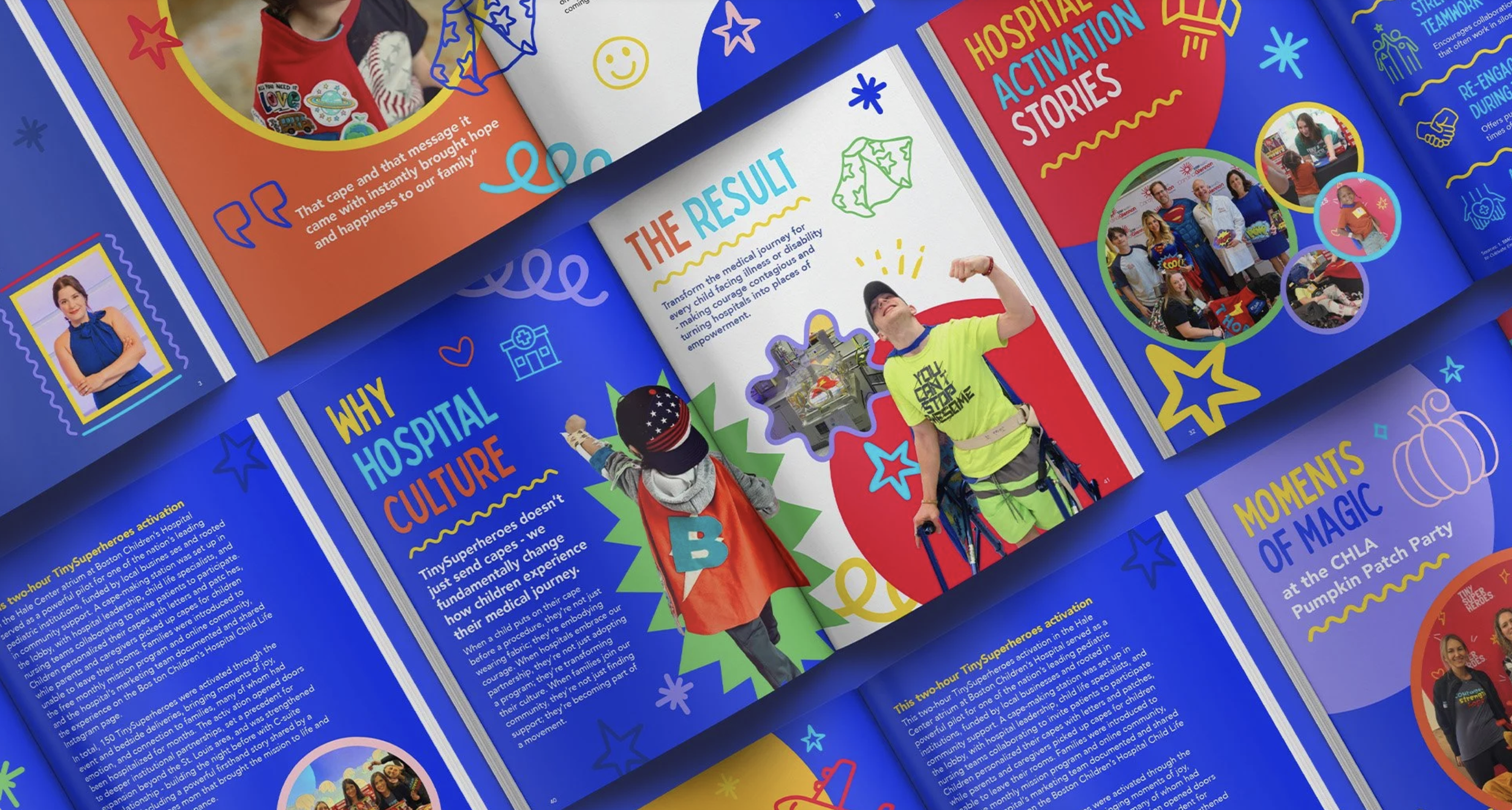
Visually, the report was designed to feel optimistic, confident, and emotionally accessible while maintaining the clarity and discipline required for institutional credibility. The system leans into bold color and expressive graphic elements to reflect the energy of TinySuperHeroes, balanced by a structured grid and strong typographic hierarchy that keeps information legible and grounded. This balance allows the report to feel human without becoming sentimental, and joyful without losing authority. The visual language guides the reader to what matters most.
Illustration and iconography were developed as integral parts of the communication system. These elements establish rhythm across the report, reinforce key ideas, and help unify content as it shifts between leadership perspectives, program explanation, metrics, and personal stories. The consistency of this visual language ensures the report reads as a single, cohesive experience, allowing the narrative to flow naturally from emotional context to operational clarity and back again.
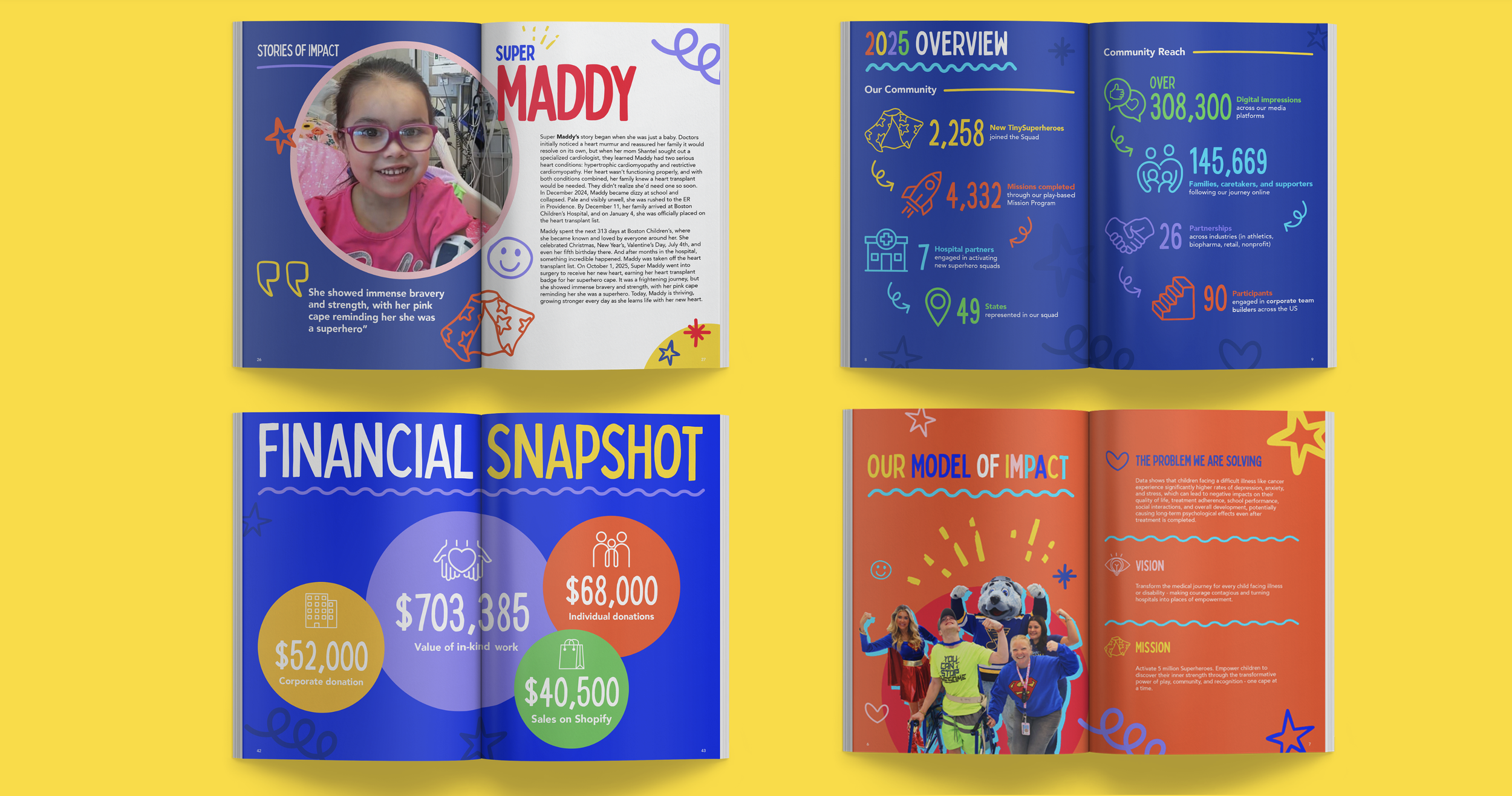
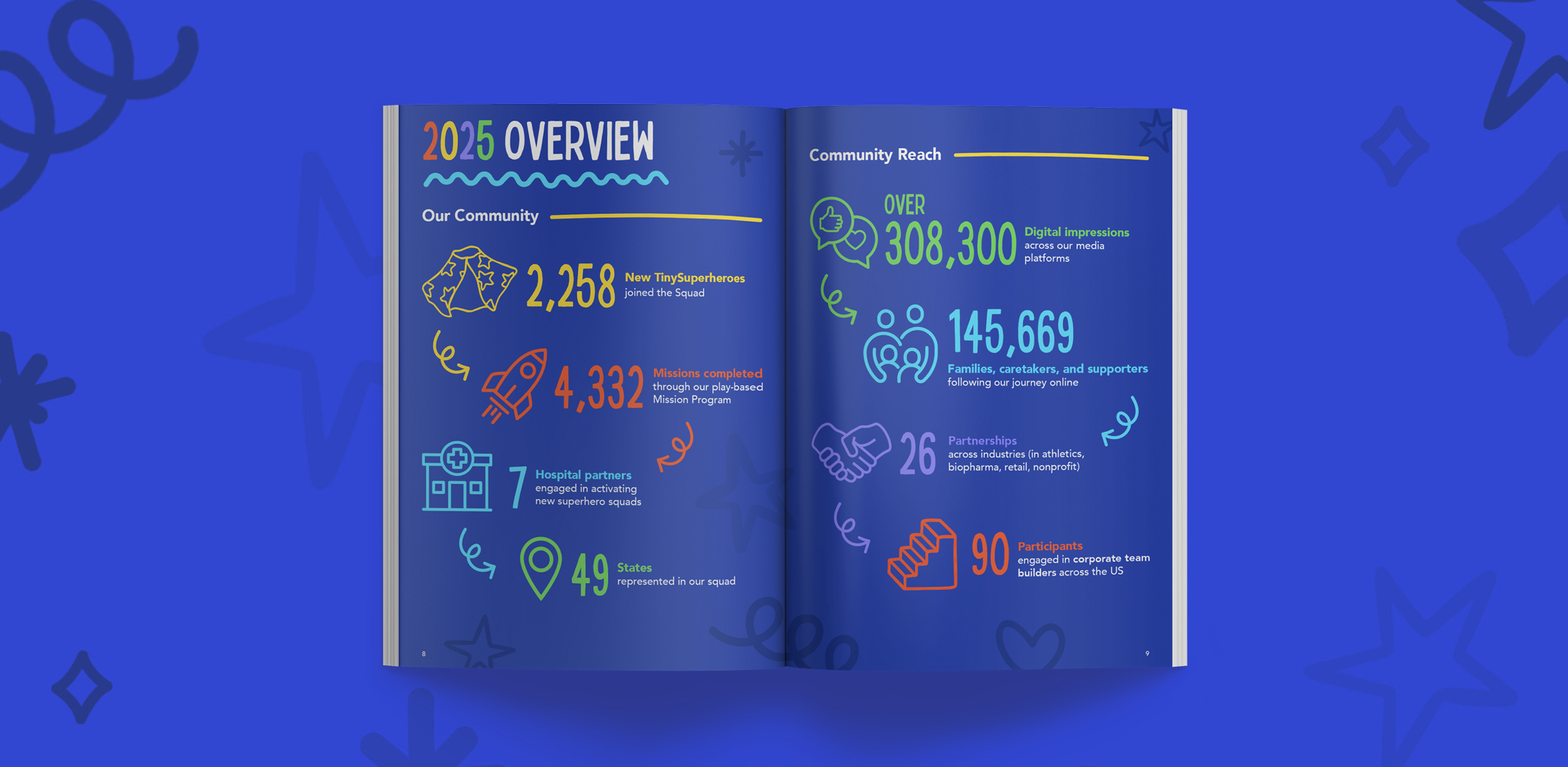
Data visualization was treated as a primary storytelling tool. Rather than relegating metrics to a summary page, key numbers were elevated into clear, high-impact moments within the layout, giving scale, reach, and momentum the visibility they deserve. Hierarchy, spacing, and modular layout were used to reduce visual noise and cognitive load, ensuring the data feels credible and easy to interpret. This approach allows impact to register as cumulative and sustained over time, reinforcing that TinySuperHeroes is building a durable model for change.
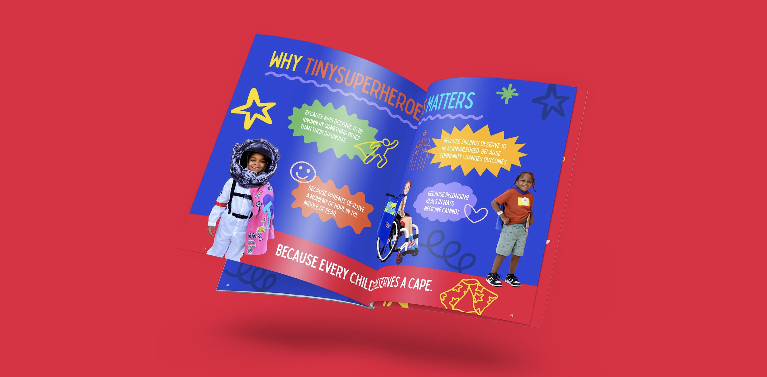
Photography and styling were approached as an intergral part of the story and layout as well. Because TinySuperHeroes operates in real clinical and family environments, the imagery needed to feel lived-in and authentic. We prioritized moments of presence and participation, children in motion, caregivers engaged, teams supporting activation. To maintain cohesion across varied photo sources and environments, we established consistent framing and stylings that unify the visual language of the report while preserving the emotional truth of each moment.
The central creative challenge was not how to make impact look impressive, but how to make it feel true. The report is designed to show cause and effect, demonstrating how TinySuperHeroes’ activation model changes a child’s experience of care and how those shifts translate into tangible benefits for families and hospital teams. This approach connects empathy with outcomes, reinforcing that emotional transformation is not separate from operational value but is often the mechanism that enables better care experiences.