
Villari Vineyards
KAL partnered with Villari Vineyards to rebrand their winery in a way that embodied their family heritage to the land their wine is made, to preserving the craft, care, and character that defines each bottle, thru to the diverse audience that purchases and has evolved with the brand over the last decade.
We set out to build a cohesive brand and commerce experience that felt elevated yet approachable, allowing customers to discover, understand, and connect with Villari across packaging, digital, and in-person touch points. Rather than treating this as a strict visual refresh, we approached Villari to go deeper, to think through the nuance of where they have been to where they want to head giving us clarity of positioning, tone and messaging which led to a distinctive visual language, and a digital experience that could support growth without losing the intimacy and equity they had built.
We worked to articulate what makes Villari distinct in a crowded wine market, a small-batch, craft winery rooted in New Jersey that produces thoughtful reds, whites, and rosé with care for process and artistry in flavor. Content was developed to balance education and invitation, giving customers enough context to understand how the wines are made, all while keeping the tone warm and inviting.
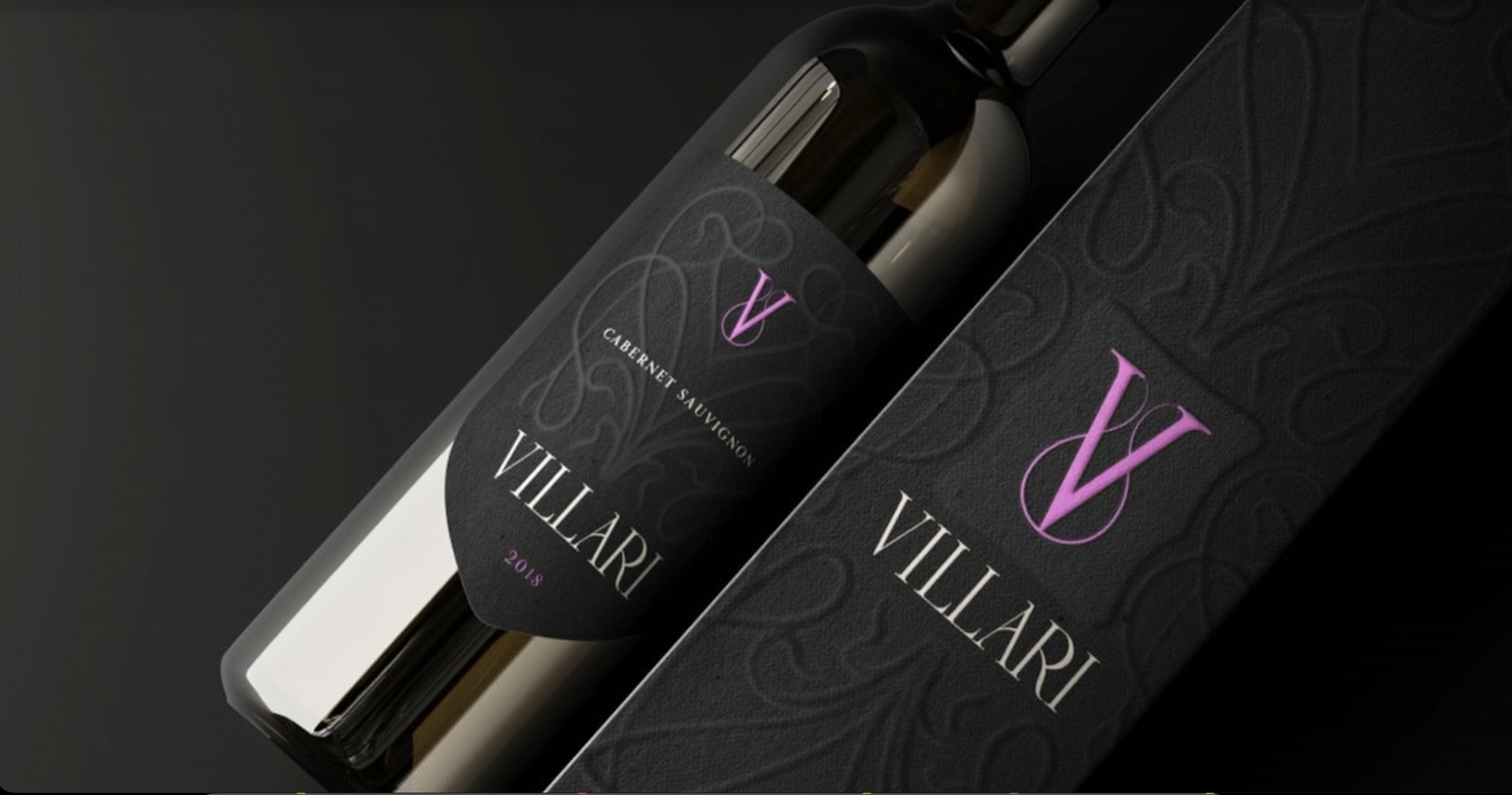
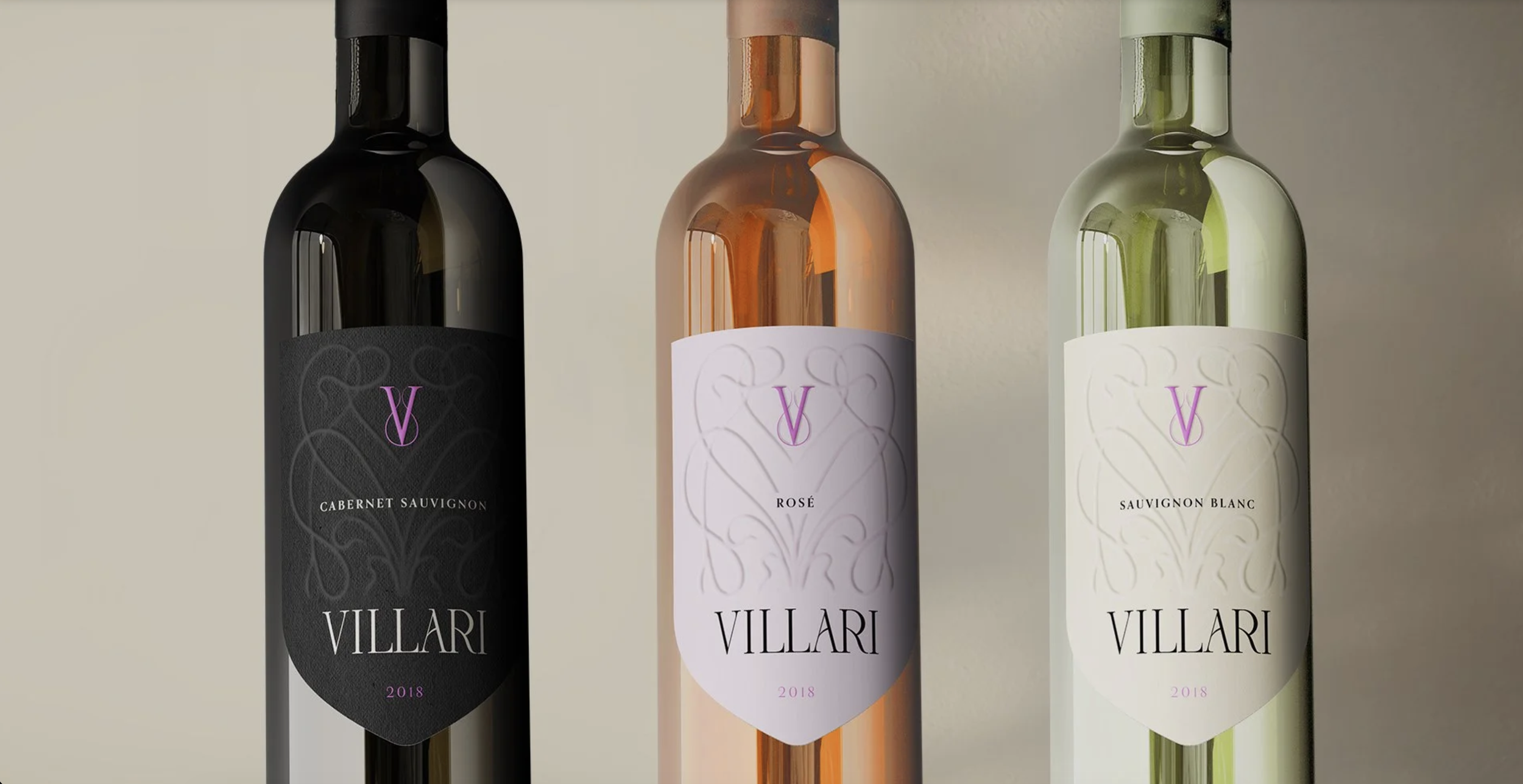
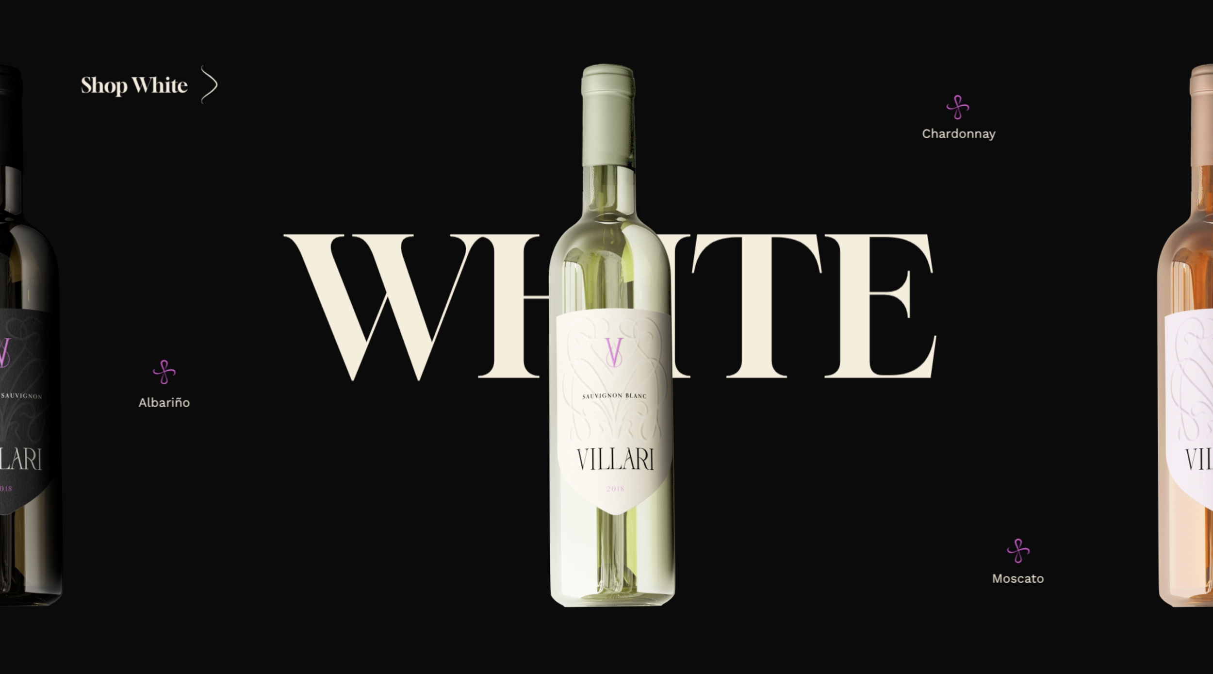
The rebrand and visual identity were built to feel elegant and modern, connecting elements from the art nouveau movement, family lineage and natural elements such the grape vines. The new system centers on an elegant typographic word mark and monogram, paired with a restrained palette that uses deep blacks, soft neutrals, and a signature accent color to create contrast and recognition. Subtle ornamental patterns reference craft and heritage without leaning into nostalgia. The result is a visual language that feels premium and contemporary while still grounded in the personality of the winery. This identity carries consistently across labels, packaging, digital touchpoints, and supporting materials so the brand feels cohesive no matter where a customer encounters it.
The package design was treated as a premium customer experience. Each wine label was designed to create clear differentiation across varietals while maintaining a unified system. Texture, pattern, and typography work together to signal quality and intention at first glance. The labels were designed to stand out on shelf without relying on novelty, using contrast and restraint to create presence. Packaging elements such as gift cards and printed materials extend this system, reinforcing the brand story in physical form and making Villari feel considered end-to-end.
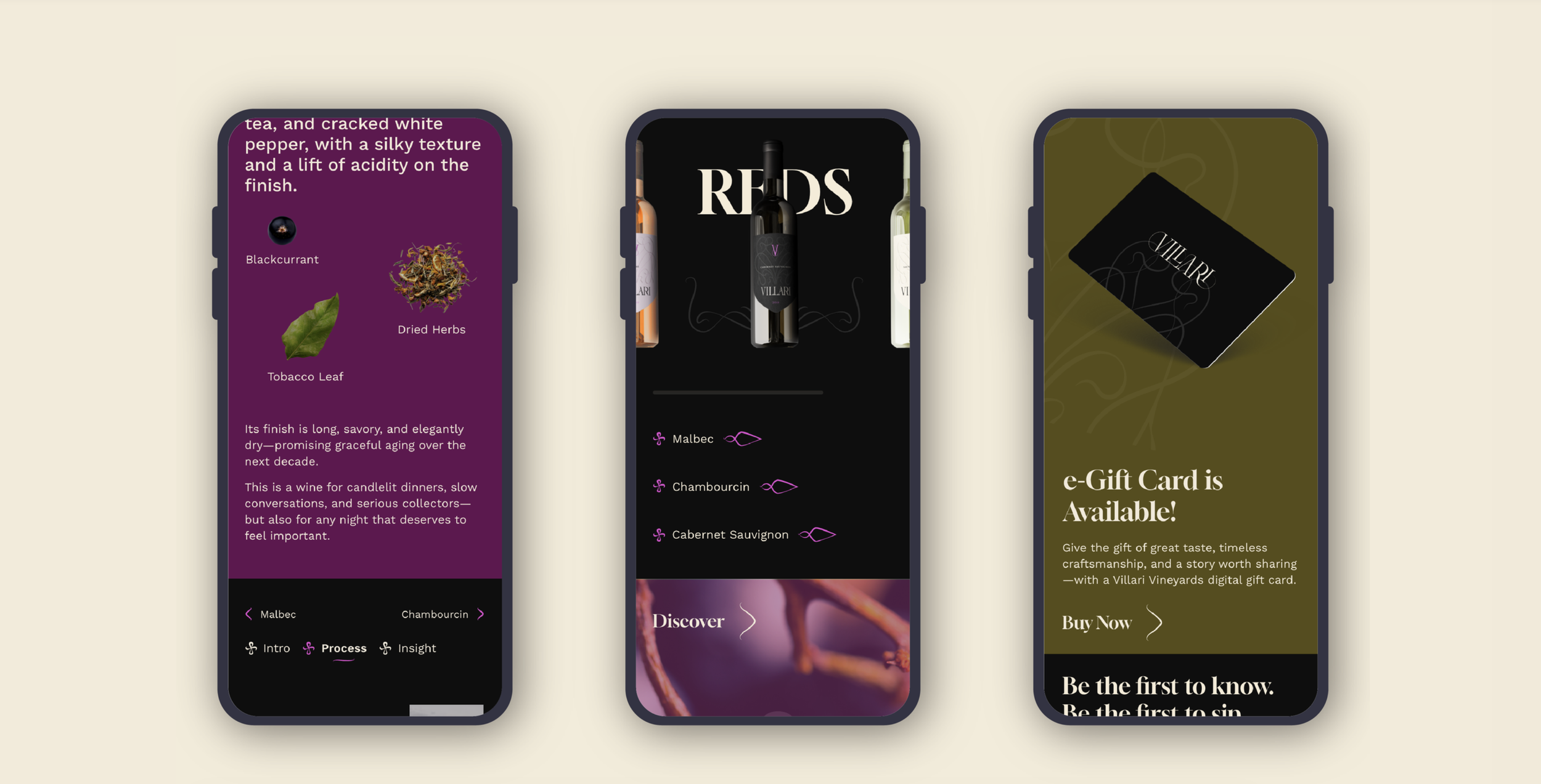
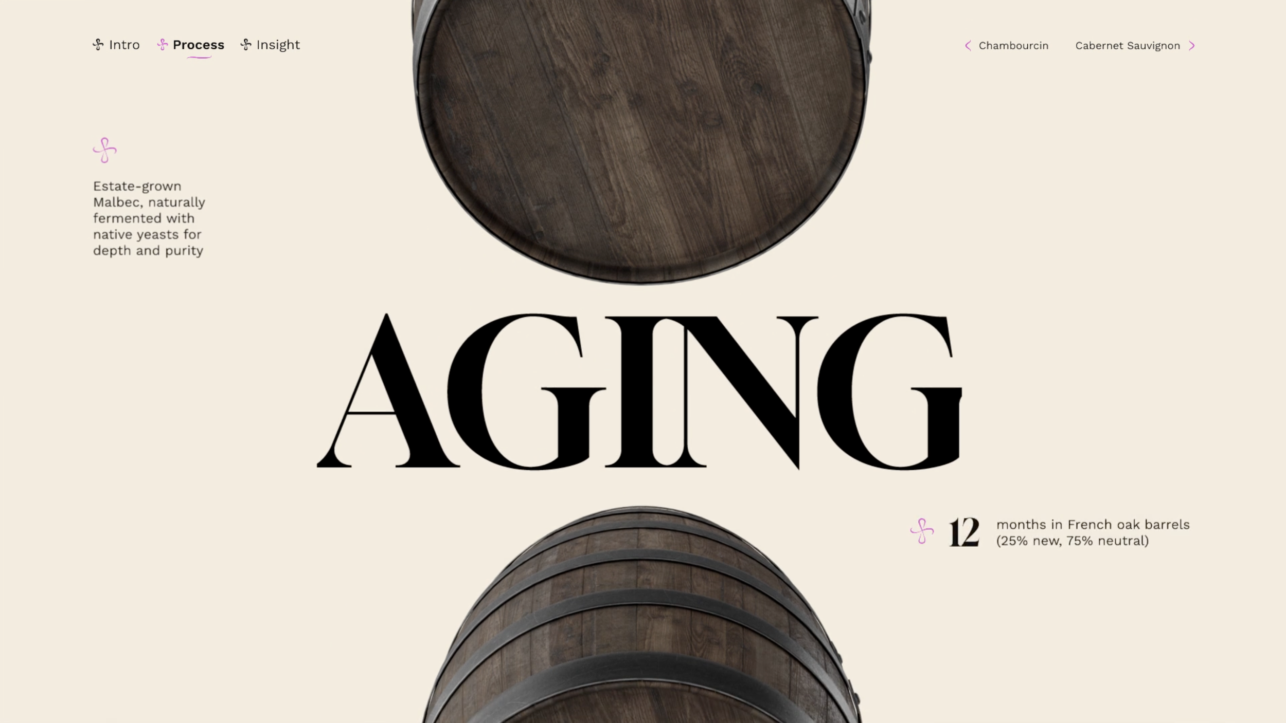
The e-commerce experience was designed to support discovery and confidence in purchase. Product pages were structured to balance storytelling with clarity, helping customers understand flavor profiles, process, and pairing without overwhelming them. Navigation was designed to be intuitive across devices, allowing users to move easily between collections, individual wines, and supporting content. The interface uses the same visual language as the packaging, creating continuity between the physical bottle and the digital buying experience. This alignment helps reduce the friction in the path to purchase.
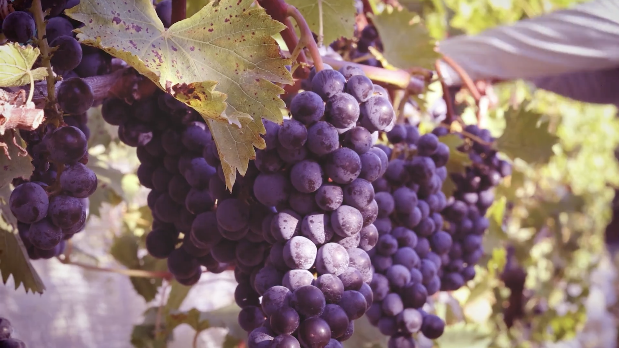
Photo and typographic styling were approached as a unified layered element. Visual content focuses on real moments and tactile details such as light on glass, texture of labels, vineyards at golden hour, and the quiet craft behind each bottle. This approach reinforces authenticity while still feeling elevated. Photography and video were art directed to work across web, social, and campaign environments, ensuring consistency in tone and quality. The imagery supports both product storytelling and brand atmosphere, giving Villari a recognizable visual presence across channels.
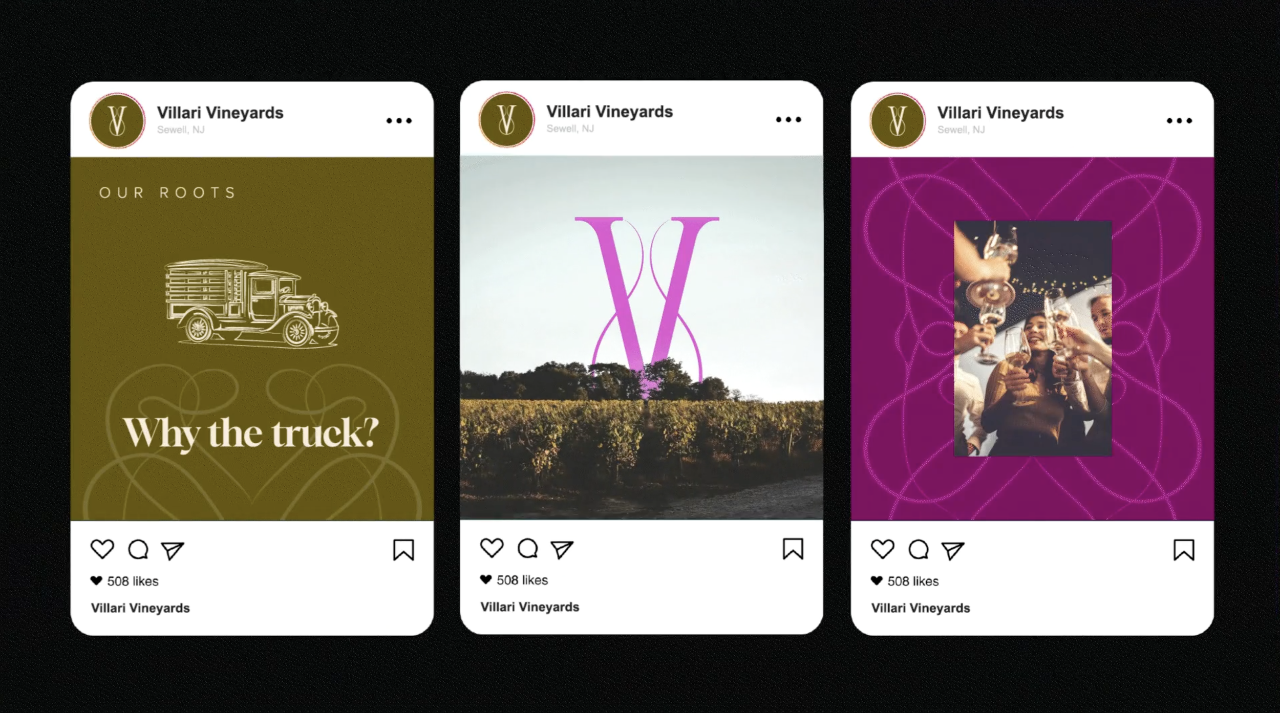
Social content was built to extend the experience into everyday moments. The voice and visuals were designed to feel inviting and shareable, creating space for product education, seasonal releases, behind-the-scenes process, and community engagement. Rather than pushing promotion alone, the content strategy focuses on building familiarity and connection over time, helping Villari feel present in the rhythm of its audience’s lives.
From label to website to social feed, the experience is designed to make a local winery feel confident, current, and approachable, while honoring the craft and family heritage behind every bottle.