
Peach and Blup


Peach & Blup was conceived as more than a kids apparel line, it was built to instill positive emotion and confident that a child can wear. Fashion and art fused into a playful, retro world designed to nurture kindness, emotional balance, equality, and positivity from the very first onesie.
When KAL partnered with the brand, our job was to translate that mission into something tangible, an identity, character universe, product line, and e-commerce experience that could feel instantly joyful while still being cohesive, purposeful, and ready for commercialization. The methodology became both a creative driver and core value, “Be Different. Be Kind. Be You!”
We began with brand positioning and storytelling, framing Peach & Blup as a world where self-expression, where every design choice reinforces belonging, acceptance, tolerance and equality.
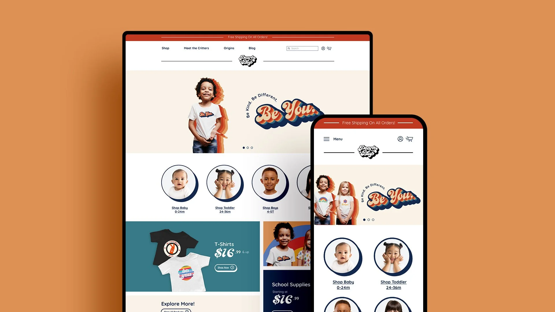
That strategy informed the identity system we rebuilt, a bold, retro logomark with layered color echoes that feels like a dimensional sticker you’d collect, a patch you’d sew on, a badge you’d earn. The color palette was reflective of an emotional spectrum, rainbow-arched warmth grounded by deep blues, allowing the brand to flex across garments, web, and social campaigns. We paired that palette with a set of illustrative and bold icons including lightning bolts, peace signs, stars, flowers, rainbows. This became our graphic shorthand for energy, optimism, and individuality, designed to be remixed across prints, patterns, and moments meaningful communication.
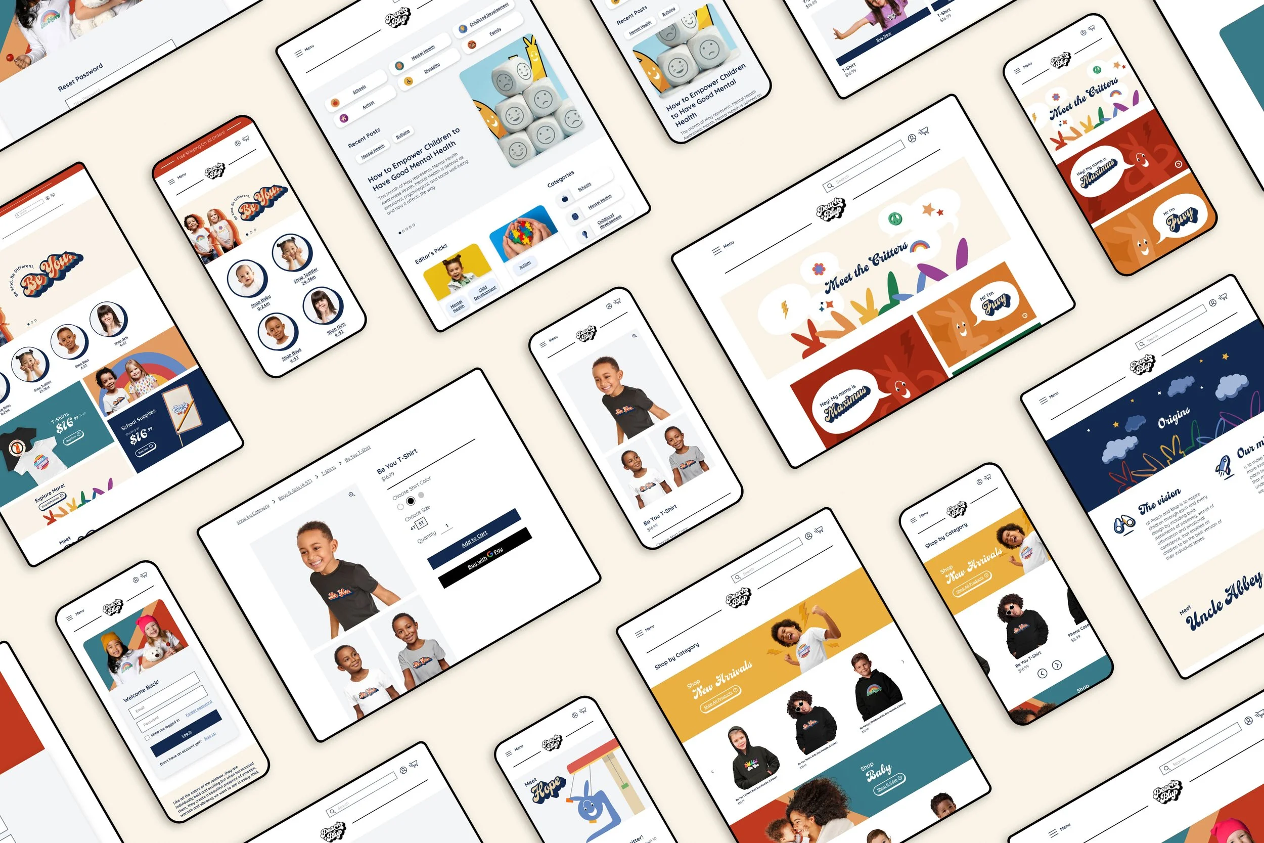
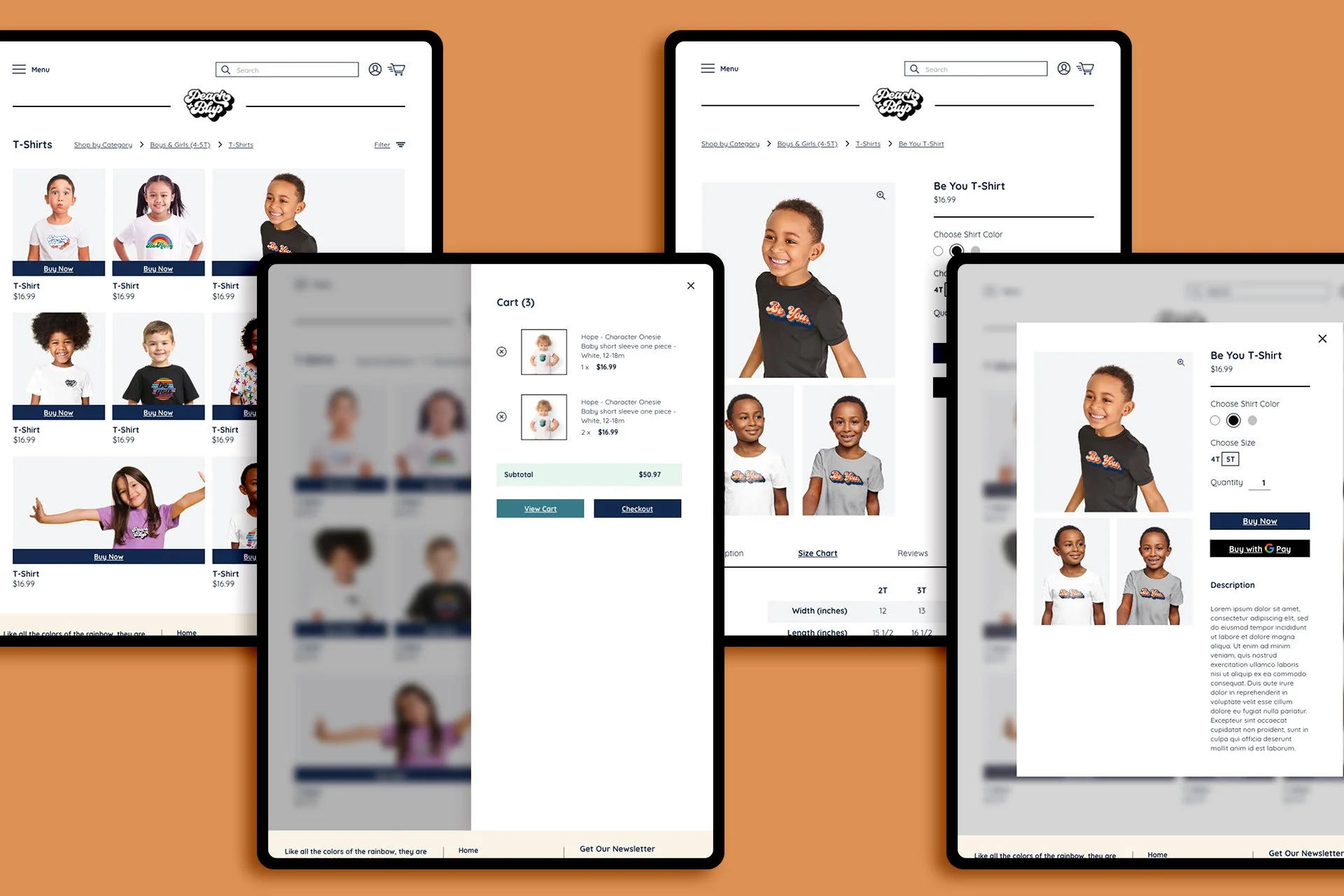
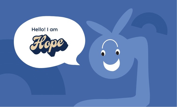
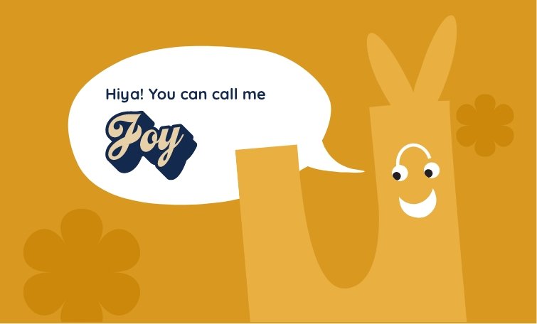
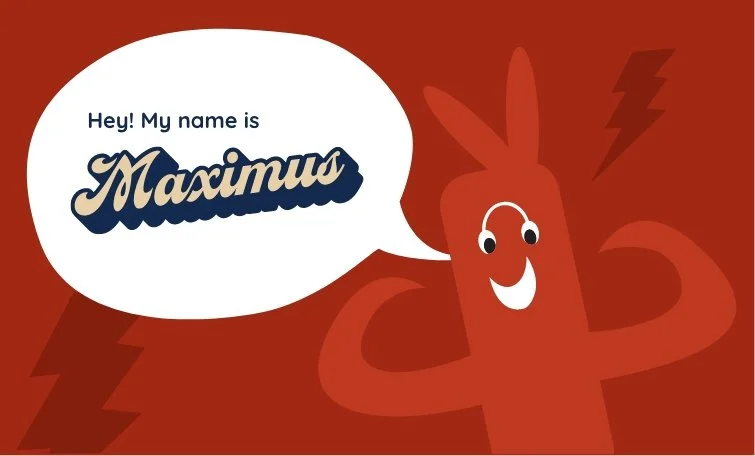
The development of the characters became the heart of the system. We design and illustrated the “Critters” into a cast with personality and presence, introducing them through a dedicated “Meet the Critters” experience that feels like opening a storybook while stepping into the brand’s values, character-by-character, color-by-color. Those characters were then translated into a wide range of apparel complimented by bold statements, “Be You, “Be Happy”, “Be Kind”. Repeat-pattern critter prints, and simple, high-contrast applications allowed the identity system read fast on kids in motion, while photographing cleanly for commerce. To support growth beyond apparel, we also designed a merch ready ecosystem of stickers and accessories. This allowed Peach & Blup to extend into the everyday objects kids actually love, while keeping the identity consistent and instantly recognizable.
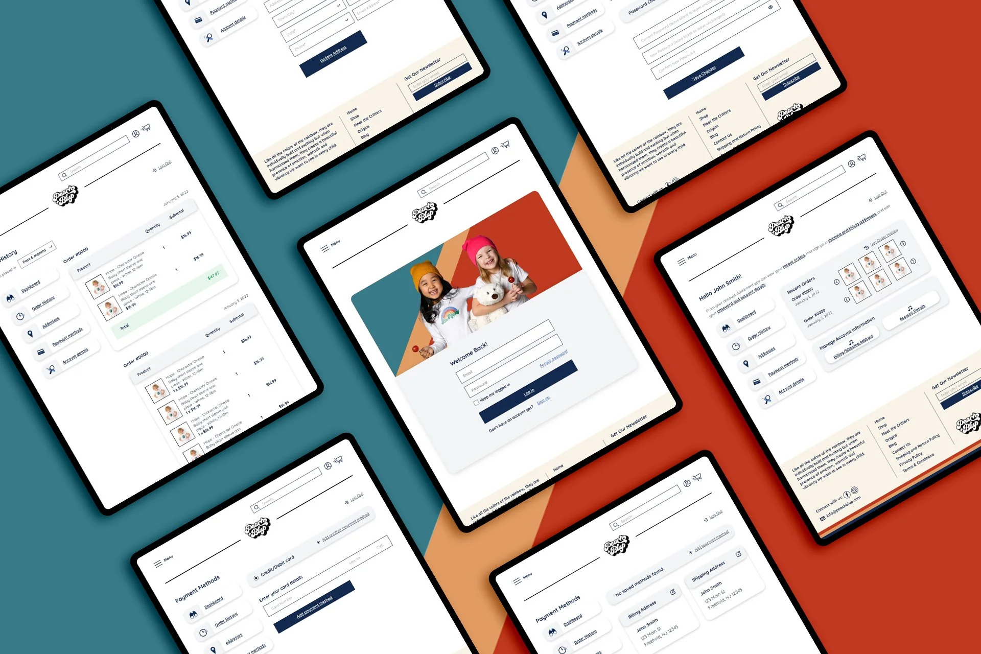
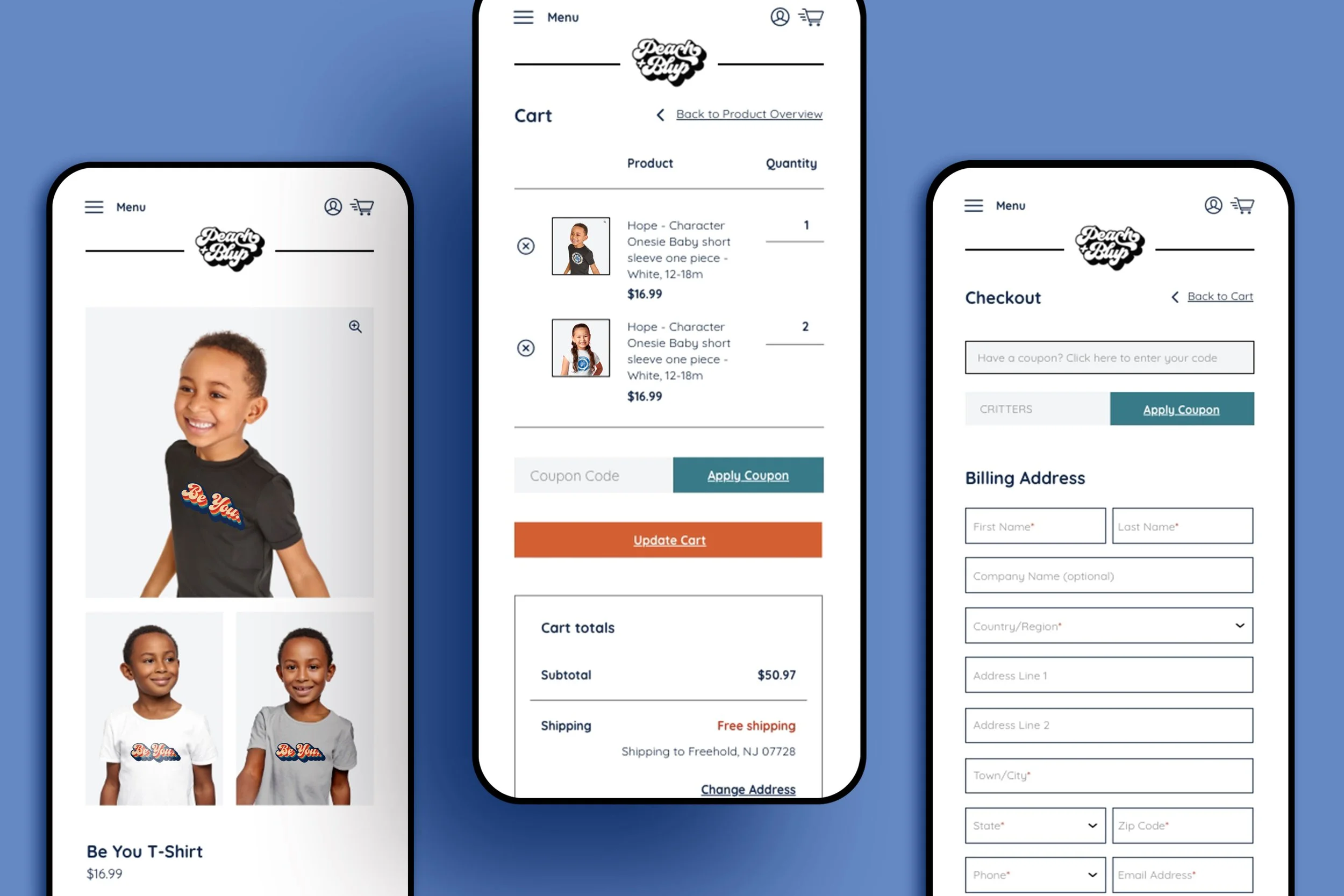
That same clarity carried into the e-commerce digital strategy and online consumer journey. We designed the shopping experience to feel bright, simple, and parent-friendly. The site leads with personality but navigates with an intuitive structure. Clear top-level pathways like Shop, Meet the Critters, Origins, and Blog, paired with bold hero storytelling that makes the brand feel alive the moment you land on the homepage. Category entry points are intentionally, visual and human. This ensured shoppers and parents were able to self-sort and navigate quickly by age or stage, while keeping discovery playful rather than transactional, leading to higher conversion and limited clicks to get to the point of sale.
The “Origins” content is strategically integrated giving a deeper look to where and what the brands mission is inspired by, the vision, compassion and brand backstory. To round out this ecosystem, we turned our attention to social content, building campaigns that could scale across lifestyle imagery, product drops, blog promotion and value led messaging.
The result was an omni-channel ecosystem where product development, character stories, ecommerce, and social all speak the same language, bright, retro, inclusive, and built to make kids feel seen and feel confident.
Results
42% YoY growth on Shopify
25% increase in orders YoY
4.25–5.25X ROAS from monthly campaign flights
34% increase in content engagement
—
Client
Peach & Blup
Sector
Children’s Apparel